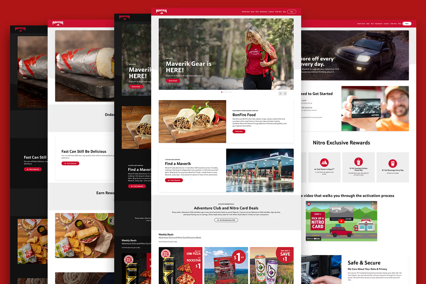
Marketing Website Refresh
Maverik - Adventure's First Stop

Project Overview
After a successful launch of the brand-new Kum & Go website, the Maverik marketing team decided it was time to update the Maverik marketing website with better functionality, scalability, and a modern look.
Site Architecture
The original site was built using vanilla HTML, CSS, and JavaScript and housed over 100 pages. Building new pages and maintaining the site became too convoluted to continue. Since the Maverik and Kum & Go sites had a lot of duplicate content, we decided to build the new site using the same Astro framework and share a lot of components between the new sites.
Instead of building new landing pages from scratch, we set up Astro Content Collections for more dynamic page building with automatic routing. We found a lot of areas to use Content Collections for dynamic content.
Design System
Maverik’s awesome UI/UX team built an awesome design system for the new site. Using Astro components, I integrated the design system into the site using Atomic Design principles. Now changes are easier, and we don’t have to worry about missing hidden elements.
The new design system features a light/dark mode toggle, respecting user’s system preferences by default, but giving them the option to switch anytime.
User Experience Upgrade
By focusing on the user journey, and new site architecture built for improved functionality, users have noticed a much better user experience. The site is easier for users to navigate and for the marketing team to update. A solid win for everyone.